Hey y’all! Can you hear me? Can you hea—
Sorry, I was on mute.
Today’s teardown is for Clubhouse, an app that my guy Shaan Puri believes is poised to fail.
Here are the finer details on this website:
B2C, specifically a mobile app for creators
Their goal is app downloads and to get people to join rooms quickly and often
Currently not monetizing, but looking to potentially do things like brand partnerships, sponsored rooms, conferences with paid access, etc.
Founded in 2020 and exploded rapidly
Hero 🦸♀️
What works
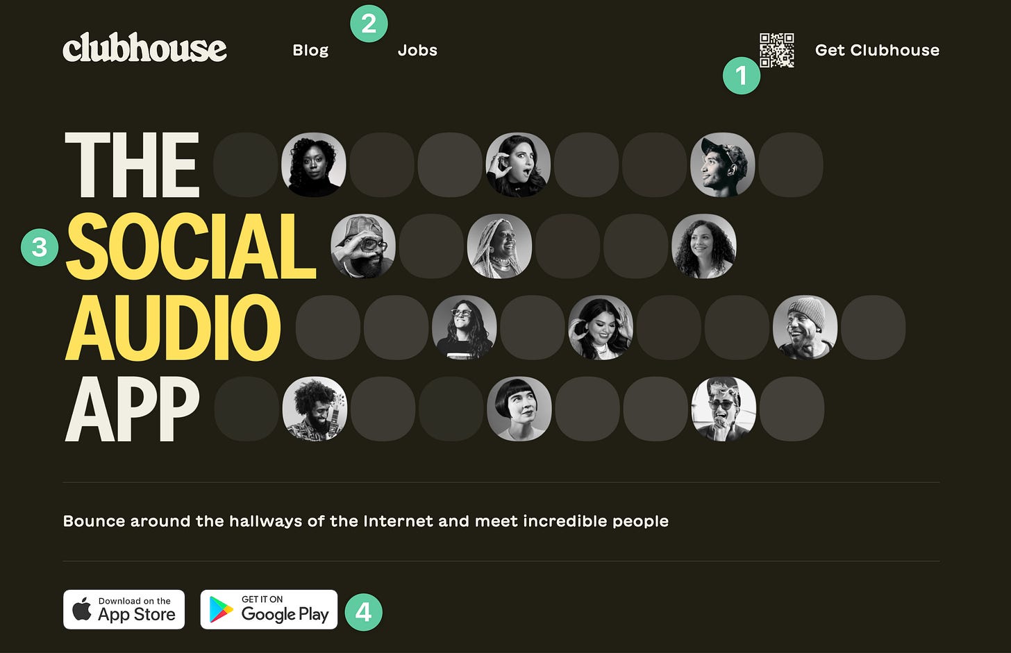
QR code right in the nav bar makes it extremely easy to download the app with no friction.
Simplistic menu helps avoid confusion and clutter. This helps the user focus on one goal: downloading the app.
The copy definitely passes the elevator pitch test. Clear, concise, and rolls off the tongue.
Additional options to accomplish the core goal are easily presented above the fold.
What to test
The imagery highlights creators, but it does absolutely nothing to educate me about the app. What does it look like? How do I use it? Does it look valuable? I would have no idea.
The subheader text is sparse and really only communicates one valuable benefit to me (meet incredible people).
This looks awkward. I’d be more inclined to click if it was JUST the QR code or JUST the link.
These app buttons got pushed too far down the section in my opinion. Worth a test moving them up.
Features 🤖
What works
The format is very clean and easy to read. Each feature is prefaced with an emoji, a headline, and then the full description.
We finally get to see some imagery of what the app looks like and what it really does.
What to test
The image could be even more valuable if it were a GIF showing how to get into a room and a brief snippet of the experience inside a room. There is context to be desired.
No CTAs in this section, which is worth a test. There were CTAs in the section right above, so no need to go overboard here. However, having simple text links in each section could prove useful.
Benefits Section 👑
What works
A core benefit is finally discussed on the site. Leading up to this point, it’s been all about what the company wants to talk about. Very little in the way of telling ME why I’ll get value out of it.
What to test
This section takes up far too much room to communicate one small thing. This info could have been displayed anywhere else on the page.
This section seems to have been placed here solely because the website content was sparse. That’s never a good reason to place content on a page.
Final CTA ☎️
What works
When you hover over this button, it pops up the QR code to quickly download.
What to test
I’d ask this question about the copy above: who cares? The page hasn’t done enough to tell me why I should download the app, what value I’ll see from it, etc. This seems like wasted space.
That’s all, folks!
Let me know down in the replies what you are going to try on your own site now! 👇


