Teardown: Coinbase
App for buying and selling cryptocurrency
Hey-o!
Today’s teardown is for Coinbase, an app for buying and selling cryptocurrency.
Here are the finer details on this website:
Historically more B2C, but also B2B wing of business
Software as a Service (SaaS) company
Their goal is to get me to sign up for an account
They monetize through trade fees, maker and taker fees, interchange fees, interest on cash, etc.
Founded in 2012
Hero 🦸♀️
What works
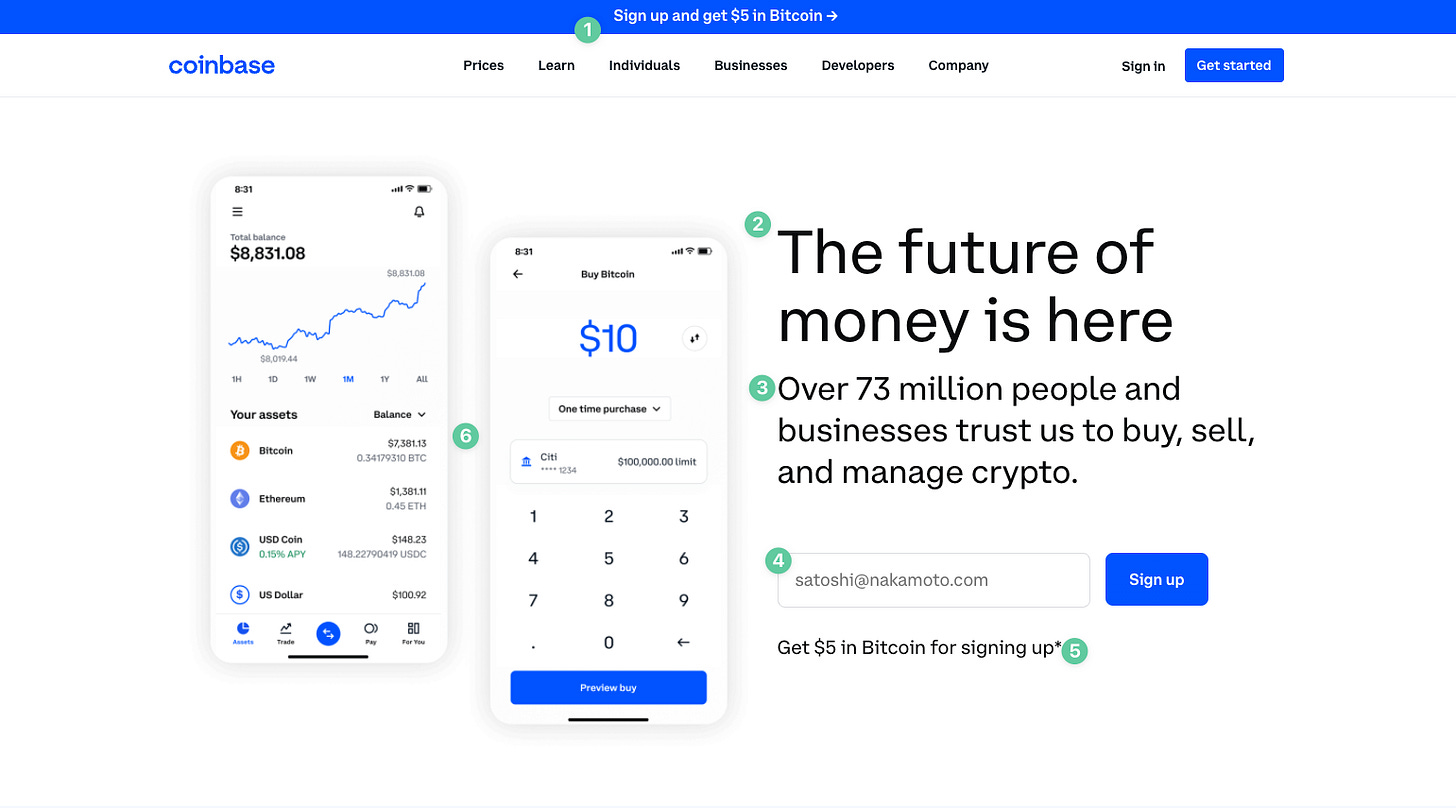
Top banner adds another level of support toward the main CTA, without changing the ask of the invitation at all.
The H1 copy is clear enough, and tells you a few core things: the product is futuristic, the product relates to money, and access is available to you now.
Subheader makes good use of social proof around their core competency. 73 million users is nothing to sneeze at.
Email field uses an inside joke to ease tension, bind the user to the community, and give context to what goes into the field.
Incentive is displayed right by the CTA, so the user feels they are getting immediate value when surrendering personal info.
Imagery gives context to the user about what the app looks like, what they can achieve inside, and gets their gears going on how they’ll use it.
What to test
There are 10 clickable links on visible above the fold, which could cause option paralysis for the user. Fewer links could be tested here.
There is little-to-no contrast above the fold. Everything uses the same hint of blue, including the main CTA button. Testing a secondary color here would be interesting.
Imagery shows more traditional crypto buying methods, but it would be interesting to see more info about NFTs, creator coins, etc. as small details of these images.
Price Preview 🤑
What works
Great use of whitespace.
Contextual CTA that tells you exactly what you’ll see upon click-through.
Attempting to update content to keep up with trends and current interests.
Imagery shows widgets in action, instead of merely trying to describe them.
What to test
Toggles links are not clickable. This should be fixed.
Features 🤖
What works
Branded feature name helps establish credibility around the feature.
H2 talks about the benefit to the user more than the nuts and bolts of the feature itself.
Contextual CTA makes it easy to know where I’m going when I click through.
Copy attempts to relate to a users daily tasks and how the feature integrates with what they already do.
Imagery shows exactly what having the feature looks like in real life.
What to test
Opportunity for social proof around the specific feature beneath (or above) the CTA.
Resources ⚙️
What works
Graphic stylings are consistent across the board.
The two CTAs are more-or-less contextual and specific, and read together they rhyme (just a little added delight for the user there).
What to test
No header in the section makes it hard to know right away what the value of the section is.
Accessibility ♿️
What works
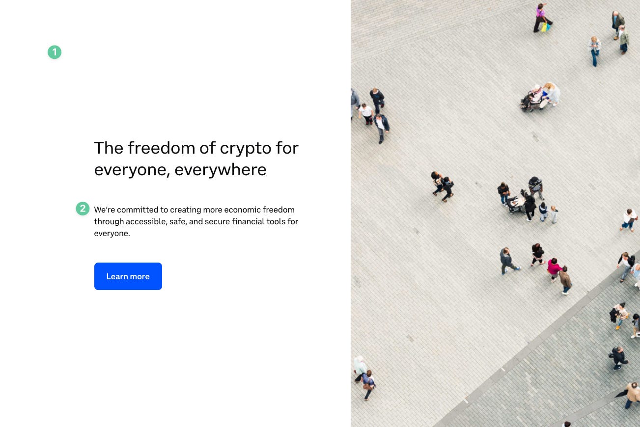
Having a section dedicated to accessibility in general is a great idea, and few companies do this.
Subheader talks specifically about the commitment the company has toward being accessible.
What to test
Imagery looks like it came from Unsplash (very stocky).
The imagery also does not match the rest of the site design (graphics, cartoons, mockups).
CTA copy is not specific enough.
Final CTA ☎️
What works
Crystal clear final copy.
CTAs are not just found in the button, but across all copy in this seciton.
What to test
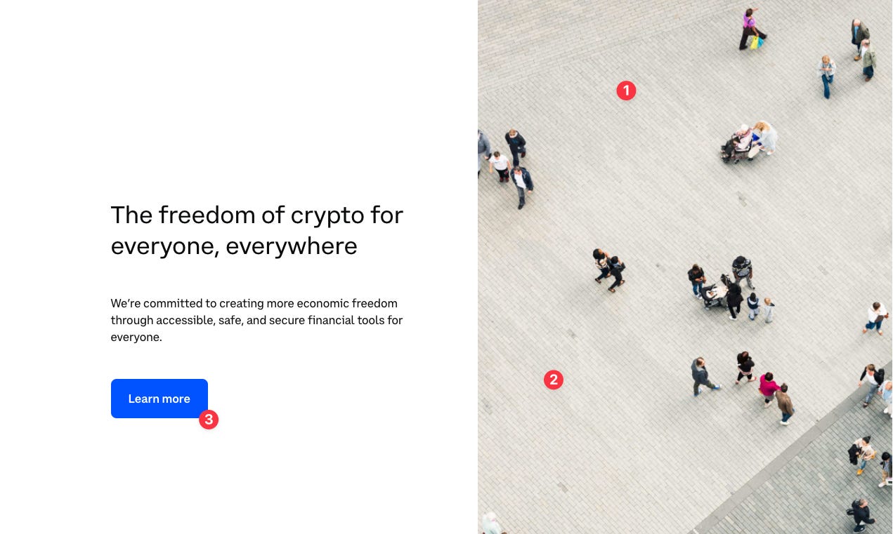
Unclear how this imagery is valuable to the user (seems to be there simply to fill space in the design).
Typically a final CTA is contained in a box or contrasting color to stand out. this design blends in with everything else on page.
That’s all, folks!
Let me know down in the replies what you are going to try on your own site now! 👇








Love the breakdown. Looking forward to more
Awesome breakdown! Learned a lot